Web Maps for Global Data Visualization:
Does Mercator Matter?
Sam Lumley, Renee Sieber
Web maps:
Are easy to make and use
Mashup data
Look cool
Help make meaning from data
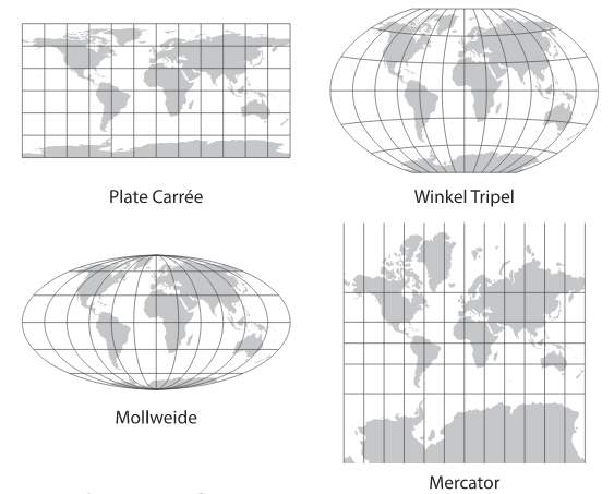
Mercator is everywhere
Why Mercator?
Does Mercator matter?
Present study
120 MTurk Participants
Two groups:
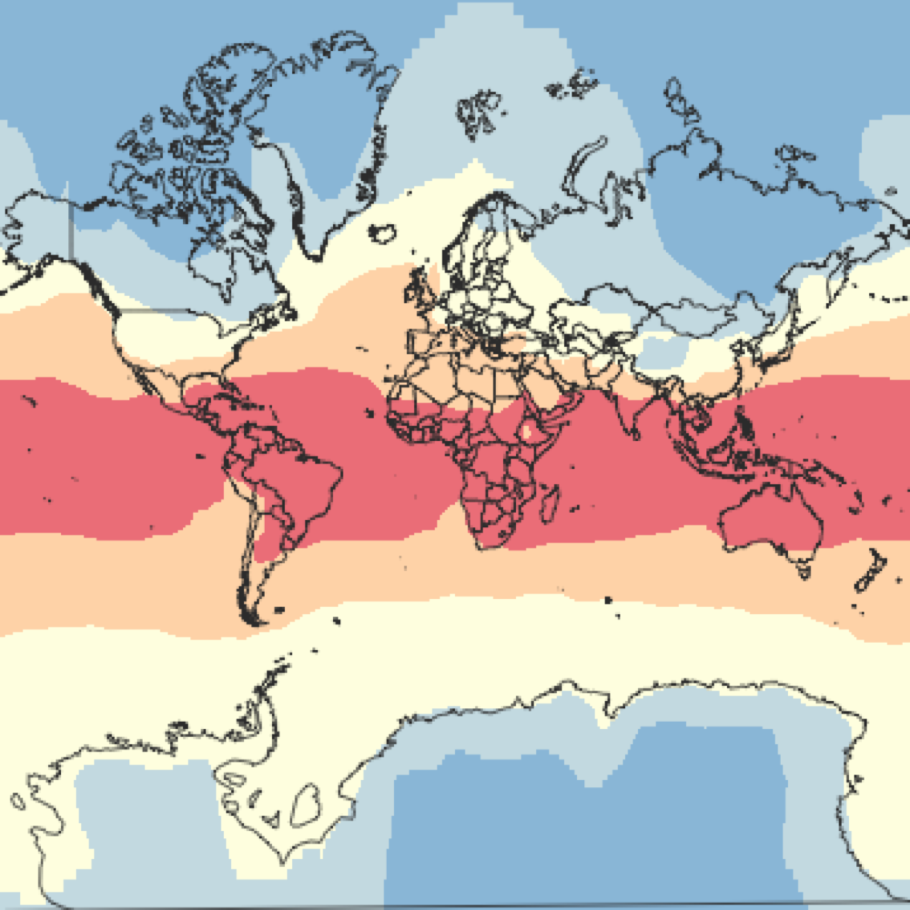
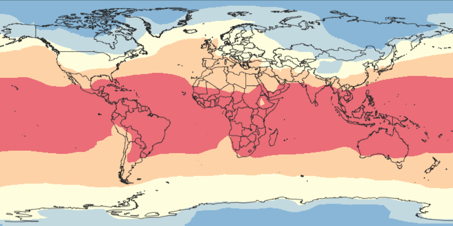
We asked:
How much of the earth's surface is covered by each colour?
Which pollutant is most threatening?
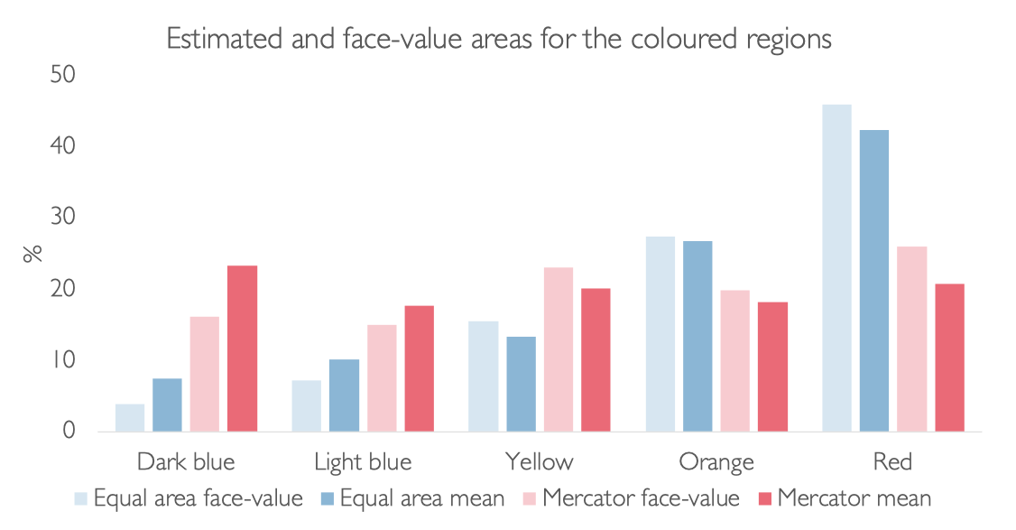
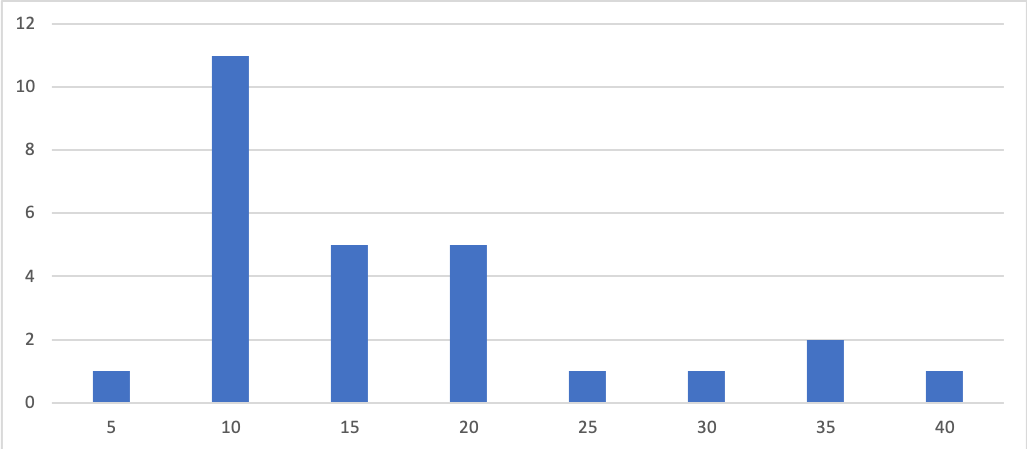
Results: area estimation
Results: Qualitative
Is pollutant A (red) more threatening that pollutant E (blue)?
Control: 17%
Mercator: 50%
Results: The Mercator Challenge
Are experts any better?
Conclusions Does Mercator matter?
Obviously, yes
Visual design matters
What should we do instead?
Use static
Wait for Google/ Mapbox to sort their shit out
Thank you!
Slides available at:
samfredlumley.github.io/mercator-pres
Links below each slide